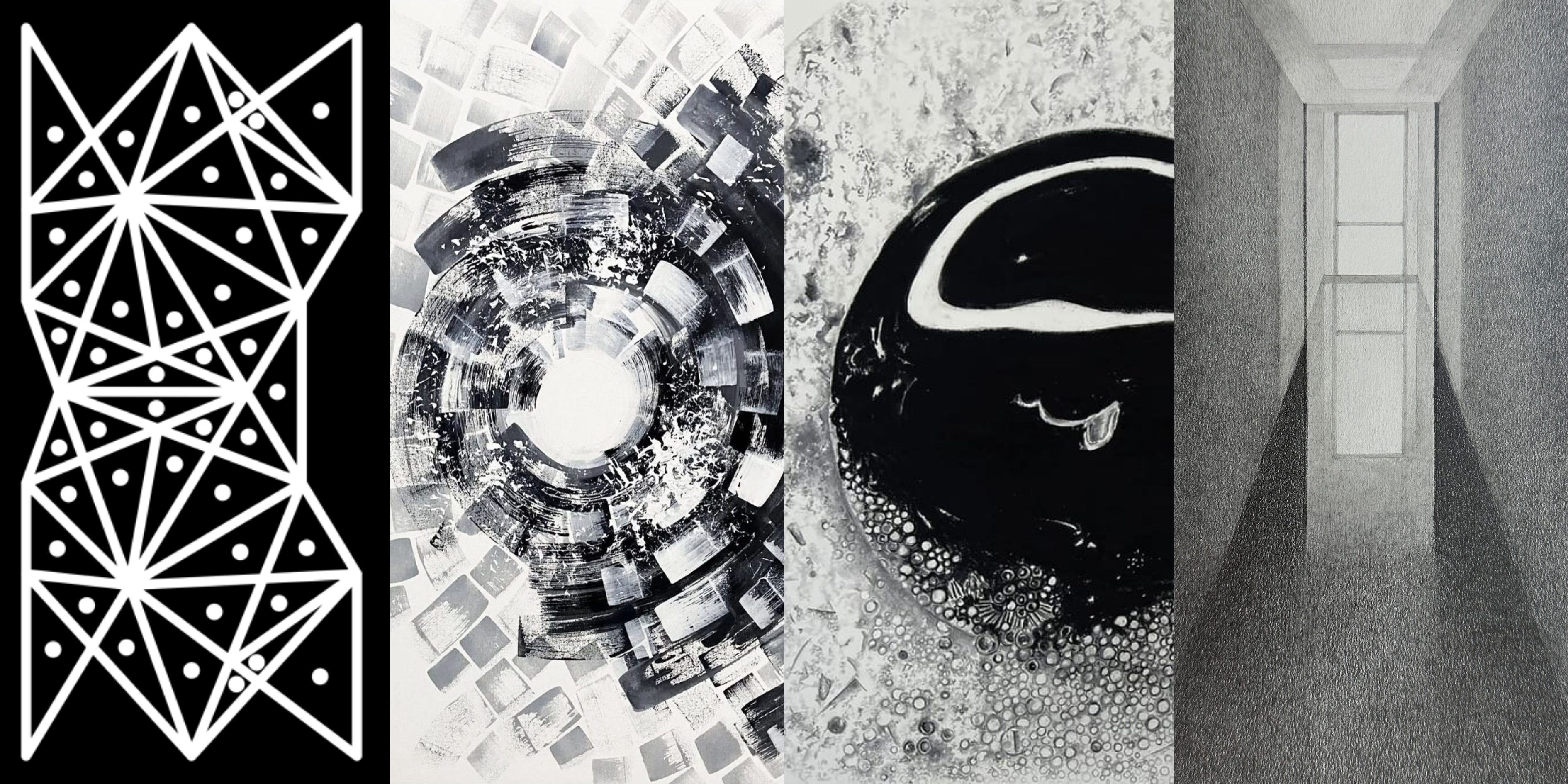
When you look up at the midnight sky, it's not the darkness and the looming clouds that overwhelms you, but the twinkling stars and the shining moon that calms you. They make you appreciate the night sky more. This interplay of light and darkness; black and white are a proof of nature being the best source of inspiration for artists.
Black is the darkest end of a colour spectrum symbolising the absorption of all the colours, whereas white is the lightest end symbolising radiation of all the colours. Together may seem like a contrasted and restrained palette, but their relationship is more than a simple opposition. Their power lies in their ability to enhance each other’s visibility creating a long-lasting impression.
For an artist, these are more than contrasting tones, they are depth, light and shadow that blend together to ornament the artworks. Each stroke of the black pigment carries with itself the tones of memory, introspection, concealment and intensity; while each stroke of the white pigment carries with itself the highlights of remembrance, realisation, revelation and growth.
MIDNIGHT SONNET, a proud production of Terrain Curated, brings together a group of artists for whom Black and White are a Storyline in themselves. They are the main characters in their composition and carry a whole spectrum of emotions within themselves. From them it’s a ritual, self-introspection, an attempt at understanding the unfamiliar and fascination for the world around.

Artist Ineshke’s practice centers on digital art through which he examines and reinterprets the art of Kolams - a traditional visual practice found within the Dravida communities such as Tamil, Telugu and Malayali. Traditionally drawn on the floor - a primarily dark surface with white rice flour, the kolams are said to bring good luck and prosperity to the family and the rice serving as a source of food for ants and insects.
The kolams naturally produce a stark monochromatic contrast creating a mesh of tradition and culture. In order to replicate its visual aesthetics, Ineshke makes the conceptual kolams digitally in black and white; the black to match the dark surface of a regular floor and white to replicate the colour of rice flour. The noir palette creates a sharp contrast together setting a rhythm and geometry, thus initiating a dialogue between the historical past, historical present and historical future. The digital recreation of the age old ritual on an unadulterated palette addresses multiple thematic registers, ranging from historiographical reflections to examination of present day cultural or perceptual conditions.
The composition creates a visual symphony that urges the viewers to look beyond the traditional conformities and delve into the layers and the repetitions of the patterns. By making all the kolams in black and white, the viewers get a uniform platform that creates a common element between all kolams in the series and enhances their uniqueness.
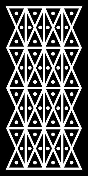
Mukkona Kolam — Series 1 — Kolam 18, 2025
Digital Image Printed on Photography Paper as a Photograph60.96 × 30.48 cm | 24 × 12 in
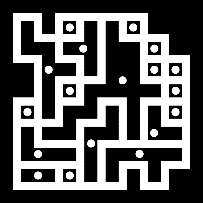
Satura Kolam – Series 1 – Kolam 3, 2024
Digital Image Printed on Photography Paper as a Photograph60.96 × 60.96 cm | 24 × 24 in

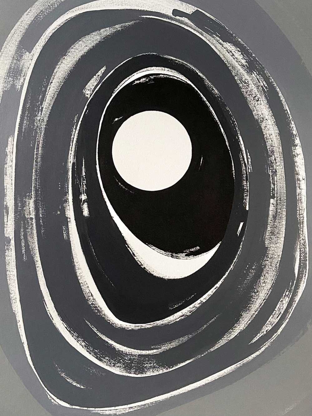
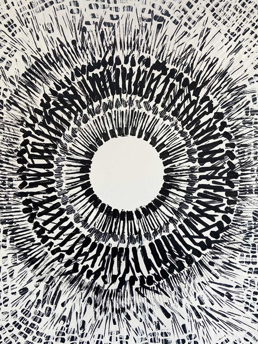
Artist Ritesh Kumar believes in the power of the universe to heal one's soul. His art chooses to focus on the dynamism and mechanism of circularity, while referencing nature, seasons, and the cosmos. The repetitions and the accumulation of marks on his canvas suggests the movements and expanse of the universe without literally depicting it.
The monochromatic palette challenges his own way of seeing the world beyond what is familiar, thus allowing him to keep a singular point of view in motion; the repetition, direction and rhythm of the marks becoming a subject in themselves. Ritesh believes that monochrome is the purest of all palettes; white reflecting everything and black absorbing everything, and somewhere between the two there is an entire spectrum of possibility. Without colours competing for attention, his art focuses more closely on movement, texture, light and the physicality of the mark.
Ritesh hopes that the absence of the whole spectrum of colours between black and white creates a space where viewers slow down and begin to notice the quieter murmurs of textures that gradually reveal themselves.

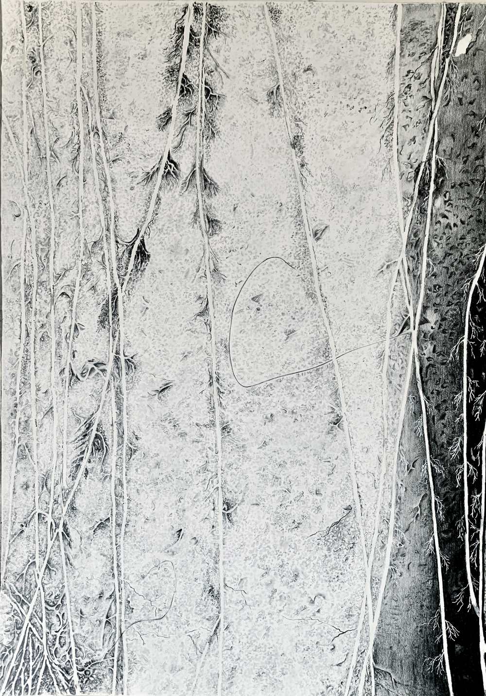
Artist Kavita Wig’s art is deeply rooted in her personal experiences and the world around her. Her career started as an oil paint artist, but gradually moved towards graphite. This movement was not a rejection of colours but a deliberate attempt at discovering the unfamiliar and seeing the world differently. She found a deeper connection with the quietness of pencil and paper. Graphite allowed her to slow down, observe and work with greater sensitivity, and soon the medium became her way of depicting not only what she saw, but also an exploration of feelings, memories and her responses to nature.
Working with Graphite is Kavita’s way of discovering rather than simply drawing. The monochrome makes her concentrate more on form, texture, light and shadow, making the original form recognisable and unfamiliar at times. The absence of colours leaves room for interpretations, the narrative thus formed is not always a story that can be explained.
The quietness of black and white creates space for viewers to interact closely with the marks, textures and lights that together construct the artworks. Kavita’s works are lived in as they are built over time. They are a blend of documentation and abstraction, allowing the black and white along with all the shades in between carry the weight of emotions and nuances of nature that often go unnoticed.
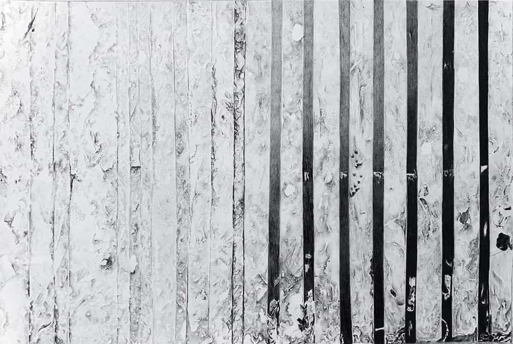

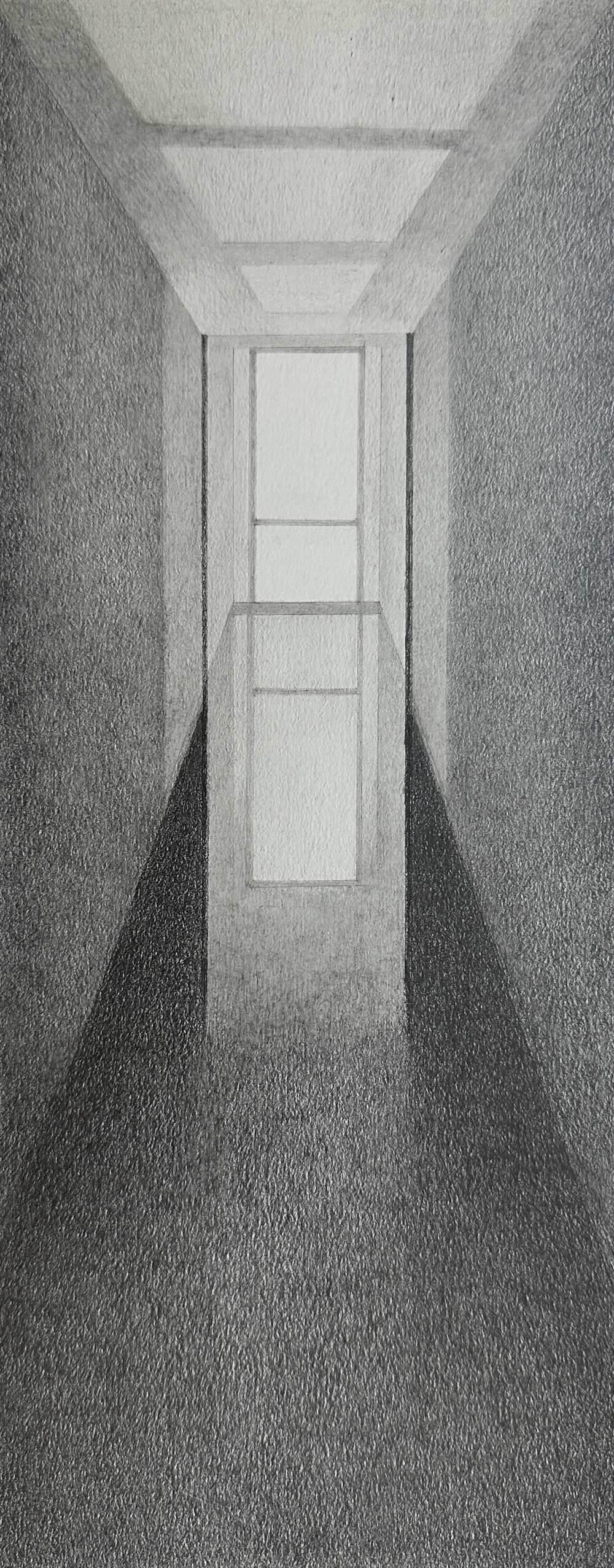
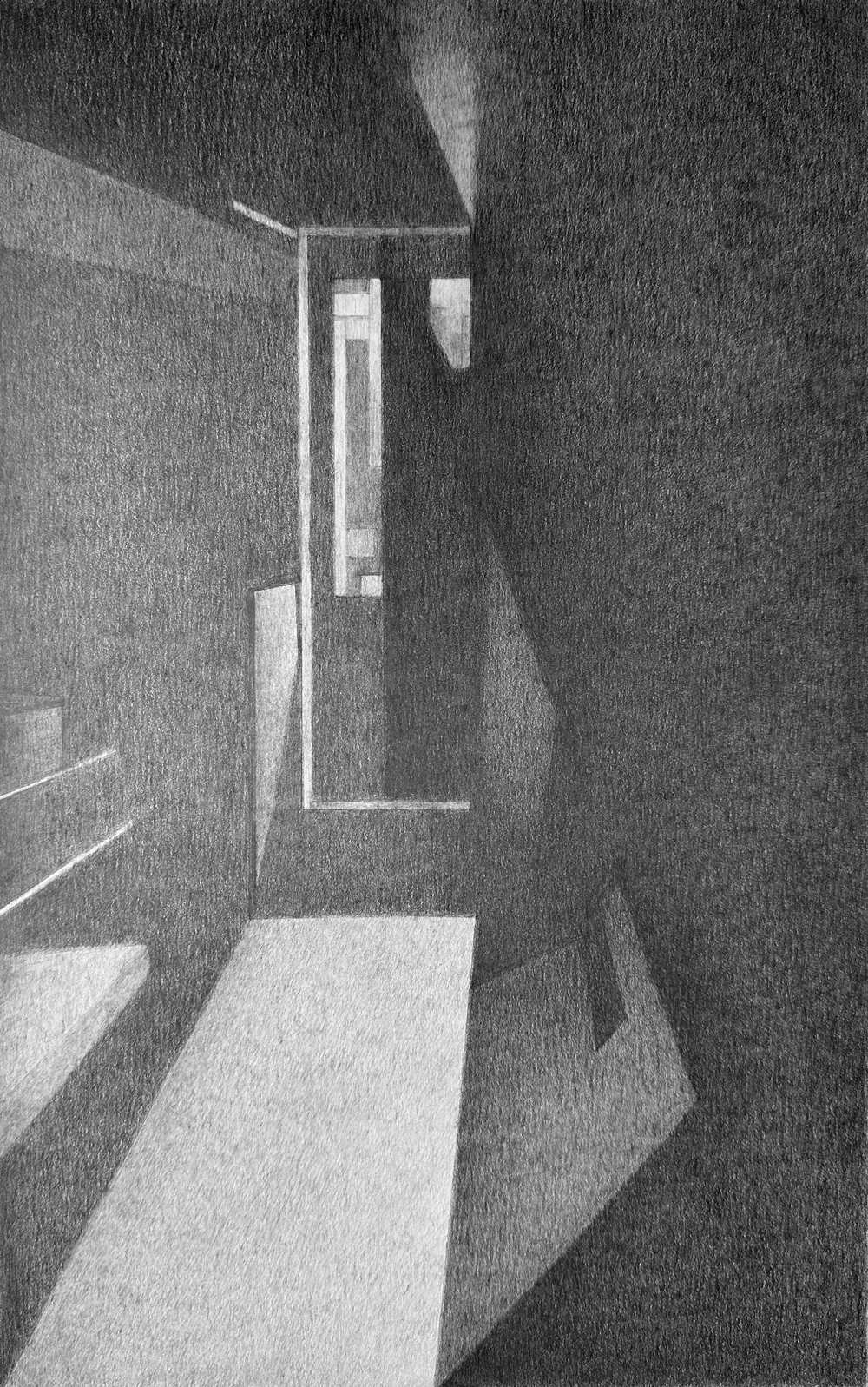
Artist Pavitra Kapur works with graphite pencils on fine grain paper building up real and imagined structures as a means of finding an emotional centre. Working in black and white allows her to focus on the essential structure of a paper rather than its descriptive details. By removing colours, she becomes more aware of line, form, scale and structure along with the spatial relationships between different architectural elements. The monochromatic palette helps eliminate distinctions that might anchor a drawing to a particular place or moment allowing observed and imagined spaces to merge, reflecting a blend between physical and virtual world.
The spaces created by Pavitra create balance and emphasize the relationship between presence and absence, much like the gaps and fragments that exist in memory. The graphite allows her to slowly build layers that suggest both physical structure and emotional experience. Negative space plays an equally significant role representing architectural voids, pauses within a composition, or moments where the viewer is invited to complete the narrative.
The ambiguity of her art allows the viewers to bring their own memories, experiences and into the work. Rather than presenting a specific place, the drawings become spaces that can be inhabited differently by each viewer.